


Wardrobe Changes For 2011-12
 Every year, the NHL Entry Draft offers hope for hundreds of players that have been chasing the dream of playing in the NHL since they were on bob skates. This year, Ryan Nugent-Hopkins became the top selection at the 2011 NHL Entry Draft as the Oilers grabbed the Red Deer Rebel with the top selection. While everyone was chatting about the picks and who may go as the second overall pick, it dawned on me that a number of teams were unofficially debuting their new uniforms or changes to their uniforms for the upcoming 2011-12 season. Ryan Nugent-Hopkins, while being first, was also the first player to sport one of the new looks.
The Edmonton Oilers have officially retired the apron strings that they originally sported when the NHL switched to Rbk Hockey's designs. This season, it appears that they will be revisiting a traditional look with a modern twist. I'm really liking the traditional colours, but I'm more hesitant to accept the design of the collar. It just doesn't feel finished. Overall, though, I like that the Oilers' uniforms have that traditional feel and not the backyard barbeque look. With the Oilers having the first pick and knowing who they were going to draft, could they not have had the nameplate for the jersey sewn down a little better? Overall, the return to a sensible jersey design has the Oilers looking respectable for the upcoming season.
From the first overall pick, we move to the third pick that was held by Florida. The Panthers had already announced that they were going back to their traditional red uniform colour that the team wore for the first few years they played. I like the Panthers in red, so I'm ok with this, but it seems the jersey redesign only had one major change: no apron strings. The old blue uniforms had the strings, but it appears that all the Panthers did was remove the strings and swap the colours. While I applaud the removal of the yellow piping, I'm baffled by the lack of creativity shown by the Panthers. No hem stripes and the sleeve stripes that get lost under the extended shoulder yoke are still a problem with Florida's current set of uniforms. As happy as I am with the apron strings gone, I thought we might have seen a better effort from Florida to get back to a more traditional design. I guess I thought wrong.
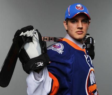
The fifth overall pick belonged to the New York Islanders, and there wasn't a jersey redesign as much as there was an addition to the 2011-12 Islanders' look. It appears the Islanders will wear a 40th anniversary patch on their shoulders this season to commemorate the team's inclusion into the NHL. Honestly, the patch is hard to see clearly in these photos, but it doesn't stick out like a sore thumb. That continues the great design ideas recently seen by the Islanders as they push forward with their traditional look.
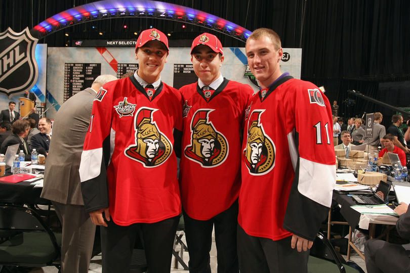
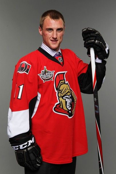
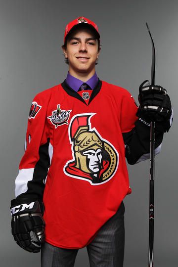
The Ottawa Senators held the sixth overall pick, and they also added something new to their jerseys. As you can see from the jerseys worn by their newest players, the Ottawa Senators will be hosting the 2012 NHL All-Star Game. The large extension upwards from the patch is the Peace Tower that is a very recognizable part of the federal parliament buildings in Ottawa, and I think the patch looks pretty good. Well done, Ottawa!
We had to wait until the 27th pick for the next jersey, and this is one we've already seen. However, it's the first time we've seen it at the NHL Entry Draft, so here is Tampa Bay's Nikita Nesterov wearing the new Tampa Bay jersey. Honestly, I like the new Lightning jersey much more than their previous jerseys. The blue jerseys are a fabulous colour, but the logos eliminate the annoying "Bolts" nickname jersey, making them automatically better.
The 38th overall pick went to the Nashville Predators who decided to completely redesign their look in terms of logos and jerseys. We took a look at the new Predators logos a few days earlier, so I had hoped the new jerseys would follow the trend that Nashville was setting in becoming simpler and better. While only the white road jersey was seen this weekend on a non-player, so there is still no guarantee that this new white jersey is the official jersey at this time, but it seems very plausible that it could be.
The Predators definitely have used the same template that St. Louis used when they changed their jerseys. In stating this, here is what the Predators will look like for next season. Not bad, right? Again, the secondary logo looks great on the white jersey. The number font on the rear of the jersey seems to be borrowed from another team as well, though. The Predators seemingly took the same font as the Anaheim Ducks use, and simply added the six lines to represent guitar strings. The guys from On The Forecheck, a fantastic Predators blog, showed off the rear of the white jersey a few days ago, and it hit me almost instantly that the font was that of the Ducks. They also posted a picture of a yellow jersey, but the Predators reportedly will not be using this exact style of jersey as their home jersey. Personally, I'm not against the yellow jersey, but get rid of the horrible wordmark off the shoulder!
Finally, the 47th overall pick was the Los Angeles Kings' first pick of the 2011 NHL Entry Draft, and they showed off their new road uniforms. If you recall, the Kings announced late in the season that they would be using their alternate uniforms as their home uniforms this season. That announcement meant that they would be introducing a new road jersey to match the home jersey in style. Thanks to what we saw on Sunday, the Los Angeles Kings have inverted the colours of the home uniform for a white version of that jersey.
While Winnipeg didn't have a new jersey to debut at this point, the prevailing rumour out of Manitoba is that the new-look Jets will wear red at home. Personally, I believe that if the team is going to use the name "Jets", they should change the logo but keep the red-white-and-blue colour scheme. Time will tell, though, as to what the new Jets will wear.
Until next time, keep your sticks on the ice!


No comments:
Post a Comment