


Where Have I Seen That Before?
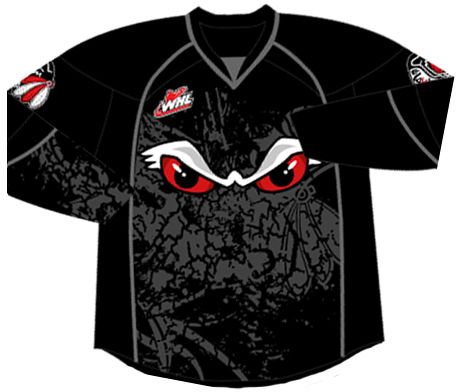
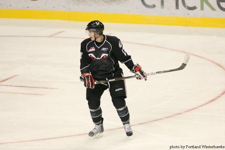
 I don't know about you, readers, but over the last few weeks we have seen some fairly uninspired, unoriginal alternate jersey designs. From Columbus' cookie-cutter colour scheme and design elements to Anaheim's rather ugly alternate uniform, there seems to be a distinct lack of creativity happening in the world of hockey. You already know that I am sick of seeing black uniforms, so don't even think about trying to pull out the black fabric when designing an alternate jersey. Yet, this last week, we saw another completely unoriginal and uninspired effort put forth by the WHL's Portland Winterhawks as they unveiled their new alternate jerseys on November 24.
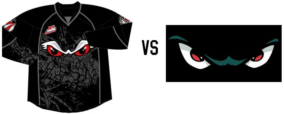
There's no doubt that junior hockey teams have to keep their fans engaged in order to make a profit. That's true for 99.9% of businesses, but hockey teams require fans to buy-in with their hearts and wallets in order for them to remain highly competitive in an ever-expanding entertainment world. Hockey teams seem to fall back to alternate jerseys as a way to capture the fans' imaginations, but there's something far too familiar about the new Portland Winterhawks alternate jersey.
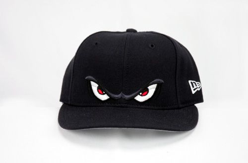
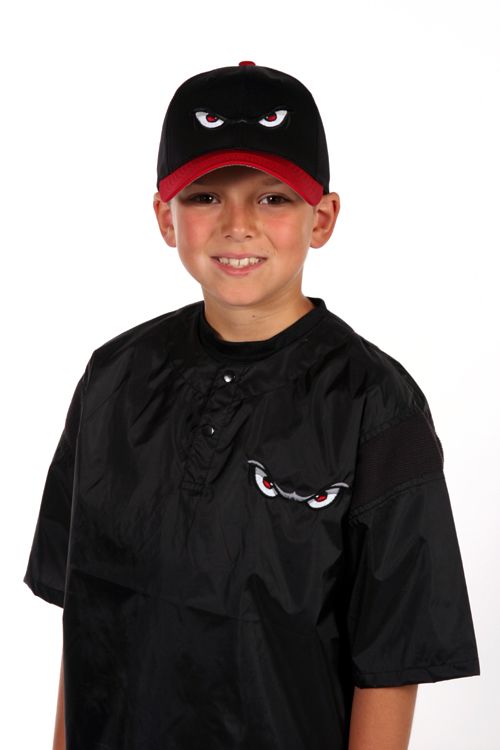
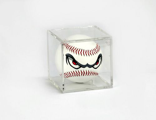
I mean, I've seen hats with that logo of angry eyes. I've seen it on shirts and on baseballs, too. So why would the Winterhawks have all of these things, especially baseballs?
Because the logo is nearly identical to that of the Lake Elsinore Storm, a Class A - Advanced minor-league baseball team in the California League. Don't believe me? Look at the comparison of the two logos. Yes, there are some minor differences, but the idea of the logo itself is definitely similar. After all, all three of the merchandise items - the hat, shirt, and baseball - come from the Lake Elsinore Storm merchandise page.
I don't know what the Winterhawks were thinking when they designed this logo and jersey, but all I think of when I see it is a minor-league baseball team. And while I'm aware that this look brings a new and "dangerous" identity to the team, it has already been done by another team in another sport.
I find this effort by the Winterhawks to be an epic fail for their lack of creativity, lack of research, and lack of colours. And I'm embarrassed as a hockey fan to find out that the Winterhawks are stealing ideas from other sports.
Until next time, keep your sticks on the ice!


3 comments:
As a Winterhawks fan, I find the alternate jersey to be just...weird. Granted, it does look like it is stealing ideas from other sports, but it is also the last thing I would even think of when it comes to Winterhawks. At the very least, the previous alternate that had the PORTLAND across the jersey in the Canadiens' style makes more sense than the one they just brought out.
I agree, Dr. Pete. I actually didn't mind the "Portland" alternate jersey, and I really thought we'd see something along those lines again.
So much for assumptions. LOL
I'm a Tri-City Americans fan and even I liked the "Portland" jersey. I liked the Portland skyline one too. The new 3rds are just weird like Dr. Pete says. As for stealing, the 'Hawks are already using Chicago's design, they (and other teams) had the chance to do something really original with their 3rds and failed.
I don't particularly love or hate the Ams' thirds, but they look just like the Kitchener Rangers' 3rds. Again, could have done something great.
Thanks for doing the research Teebz to find the baseball eyes :)
Post a Comment