


NCAA Good Cop, Bad Cop
 As some of you have seen on this blog, I have railed on certain NHL teams for their unbelievable and seemingly ridiculous jersey designs. I'll admit that I like the way hockey looked before Reebok got their grubby mudhooks all over the game, but corporate dollars are what they are, so who am I to criticize business decisions? In speaking with Phil, bench boss for Uni Watch Blog, we wanted to take a look at the NCAA's jersey choices, but there are literally hundreds of teams when you include both the men and women. So, instead, we decided to focus on the 16 best men's teams in the NCAA. Those would be the 16 teams participating in the 2009 Frozen Four in Washington, DC. Before we get started, here's Phil with a couple of paragraphs on how this collaboration started.
Earlier this week, a reader commented on whether or not there would be a review of the "Frozen Four" Hockey Uniforms. Teebz immediately expressed interest and so, as is my wont, I approached him to assist me with what follows. Basically, the "Frozen Four" is the hockey equivalent of the NCAA basketball tournament, with a few differences. Rather than a field of 65, the Frozen Fourincludes the top sixteen college teams, broken up into four regions (East, Northeast, Midwest and West), who face off (pardon the pun) against each other until a champion for each region is decided. We then have the "Frozen Four", which is taking place this year in Washington, D.C. Additional information on the Frozen Four can be found at the always trusted Wikipedia site.
Since I don’t know much about hockey, but I do know unis, I have entrusted the aid of Teebz in preparing this article. It will focus almost exclusively on the uniforms of the sixteen teams in the Tournament, as they were ranked coming in (#1 through #16 — although they are seeded as #1 through #4 in each region). Teebz will take the reserved, measured, studied look at each teams’ uniform, from a hockey historian and player perspective, while I will pretty much just tell you what I think about them. I have often said that of the four major sports, hockey uniforms are without question the best from a variety and color perspective. Lets see how the college puck unis stack up. — Phil
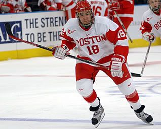
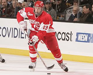
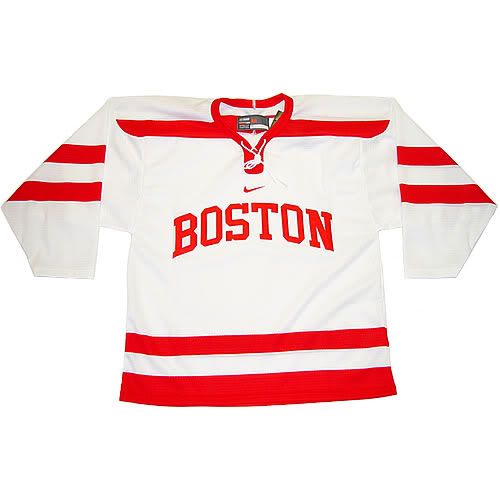
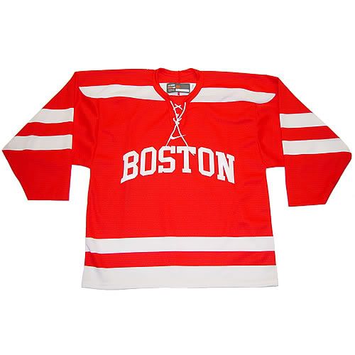
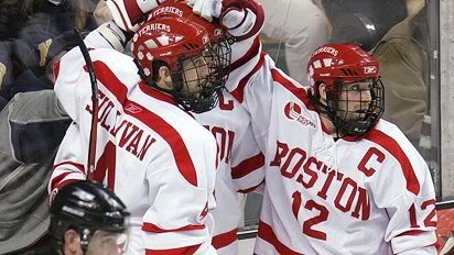
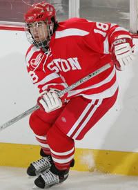
Boston University Terriers: Home, Road, Alternate White, Alternate Red.
Teebz: Boston University is the Detroit Red Wings of the NCAA. They have timeless uniforms that stand out with their solid colour and striping scheme. The only major drawback that I can see are the number of swooshes displayed by the players. There are four on the knees and thighs alone. And do you really need four jerseys? C’mon, BU, that’s ridiculous.
Phil: Well, if BU is the Red Wings of the NC2A, then why do they have two alts? FAIL. However, I’ll concede the regular home and away are gorgeous. I love the armband with the different color opposing color numbers, and that font is a keeper. The Nikeified alts aren’t garish, but they aren’t necessary — the shoulder stripes add NOTHING. I do, however, like the lace-up collar. (In Nike’s defense, Rbk did begin the shoulder wings.)
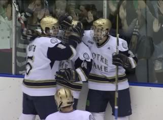
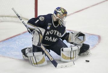
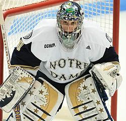
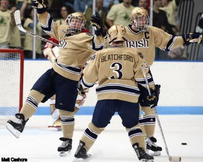
Notre Dame Fighting Irish: Home, Road, Alternate.
Teebz: The home and road jerseys are solid. I like the colour scheme used, and the font makes the jerseys feel a little more traditional. The alternate, however, is not something I would want to wear often. While it could be used either on the home or road, I’m not fond of that particular shade of... whatever that colour is.
Phil: As far as the "regular" home and away: the font kicks ass! Nice socks, good color scheme of blue, gold and white. Nothing superfluous. These look like hockey sweaters. Gold helmets are a nice matte finish. Quite frankly, I’m surprised the three stripes could pull off something as nice as this. I could do without the drop shadow on the numbers, but I guess that’s kind of a puck tradition. Now... those gold alts — I don’t hate them, but I’d have preferred they stuck with the same elements found on the home and away unis.
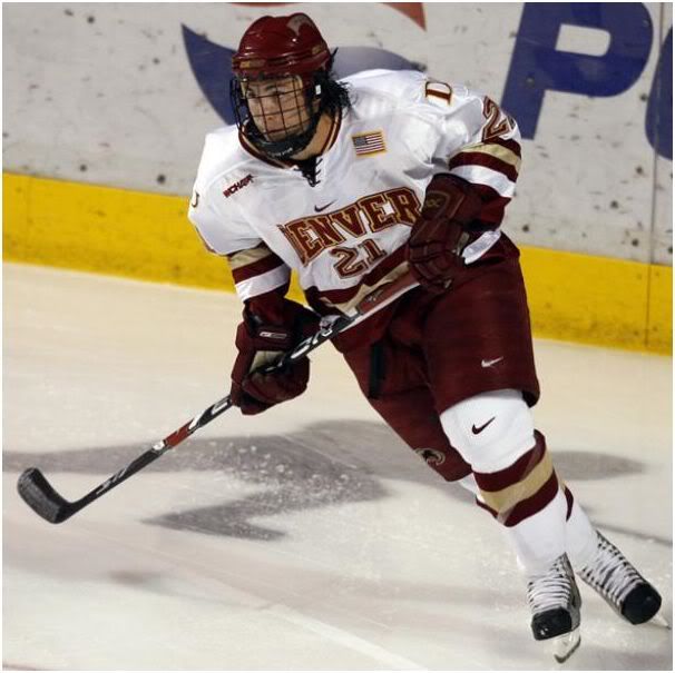
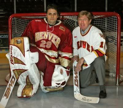
University of Denver Pioneers: Home, Road, no alternate.
Teebz: When scouring the Interwebs for photos of the Pioneers in action, nearly every photo had them in their white home uniforms. And that’s ok because they look pretty sharp. But they really need to wear their crimson jerseys more often. They’re pretty sharp with the gold accents.
Phil: That’s burgundy crimson? Looks like maroon to me. Either way, I’ll agree with Teebz here. That’s another solid uni — it looks like a hockey uniform (ignoring the many swooshes on pants and knee). But Nike didn’t crap it up with a "Bettman Bib" and pit stripes and such, so commonly found on NHL unis. Beautiful socks with strip design echoed on the sleeve. Good stuff here.
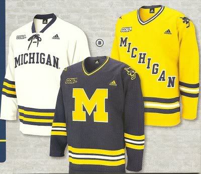
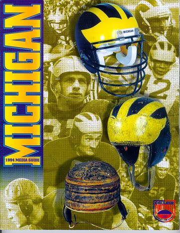
University of Michigan Wolverines: Home, Road, Alternate.
Teebz: The white is traditional, and looks very classy. The blue is very much a Michigan colour, and looks great against the ice. The yellow maize jersey is hard on the eyes. A skating beacon doesn’t work so well. Leave the alternates, and stick with the white and blue, Michigan. The helmet design? I suppose I can give that a pass as it is distinctly Michigan.
Phil: Three different font styles (two with actual words, one with a big "M") for three different jerseys. Really? But I gotta say, I do like the home white. Nice vertically arched wordmark, lace-up collar, and three blue stripes sandwiched in between two maize... wait. Aren’t these made by adidas? Could have fooled me, perhaps that’s some subliminal advertising? Nah. Well, it’s still a solid look. I’ll give adidas and Michigan a pass and say the three stripes were purely coincidental. The blue sweater with the big "M"... meh. It does look old school — old school like a football uni should look. I actually prefer the diagonal lettering on the maize alt and that’s totally Michigan’s color, so that would really work for me as a home and not an alt. I say, pick one style and stick with it, but that’s just me. I like consistency throughout the uni and well, this ain’t that. As far as their "iconic" helmet design? It looks best on their football squad. Let’s keep it that way, and lose it on every sport that isn’t football, k?
Yale University Bulldogs: Home, Road, no alternate.
Teebz: Yale appears to be the Toronto Maple Leafs of the NCAA. The traditional blue-on-white home jerseys and white-on-blue road jerseys are classy and timeless. The best part of Yale’s ensemble might be that there are no sponsor logos all over the uniforms.
Phil: These guys, according to a conversation I just had with Teebz, appear to be a "non sponsored" school, meaning they’re not outfitted by any particular manufacturer. That would explain the swoosh on the breezers, the Bauer stick, and the three stripe sock pattern — I may be naive, but I doubt a Nike school would permit socks like that with their unis. As far as the unis themselves, I like them. Y’all might find them "boring" but they’re staid and understated, but far from boring. Typical Ivy smugness (or maybe traditionalism) is evoked by this uni set. It’s like, "We’re bloody Yale, deal with it." Still, it’s a solid, if unspectacular uni. No major complaints here.
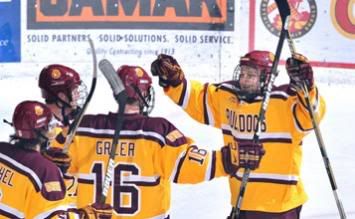
University of Minnesota-Duluth Bulldogs: Home, Road, Alternate.
Teebz: Overall, these are pretty decent jerseys. The home jerseys are a clean white with minimal flair. The road jerseys are similar in their crimson design. The alternates, however, are beacons again. The one thing that saves the alternate jerseys, though, is the striping across the chest. I like the colour scheme.
Phil: OK, these rank pretty low on the list, lowest so far. Maybe it’s me, but I’m not really a fan of cartoon characters as the crest. The colors aren’t bad, and the yellow (gold) is certainly more muted than Michigan’s maize. Home uniform is at least not crapped up with a lot of superfluous garbage, while the road is essentially a mirror image of the home, which I like. Doesn’t mean I like the uniform, just the uniformity of the uniform. I get why they’re trying to do with the alt, but it’s not really working. What I think they’re trying to do is evoke a very old-timey feel (never saw what their old unis looked like, so maybe this is some kind of throwback). Just don’t like the burgundy and white stripes on a gold uni. Sorry. Not working for me.
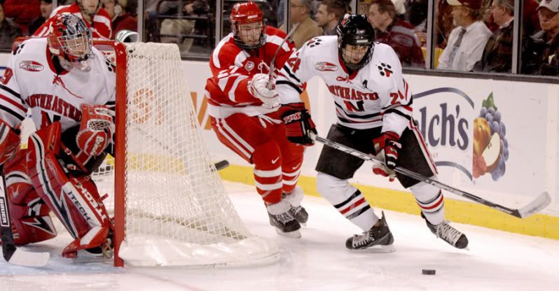
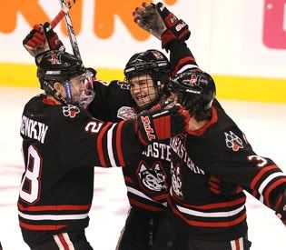
Northeastern University Huskies: Home, Road, Alternate.
Teebz: The Huskies are the Chicago Blackhawks of the NCAA. While I’m not saying they are using the Blackhawks’ jerseys, they look awfully close. In any case, the Huskies look good in their uniforms. My only advice would be to lose the black alternate. It’s unnecessary when the red and white jerseys look so good.
Phil: I’m inclined to agree with pretty much everything Teebz said above. Without prompting, my first thought was "Blackhawks" ripoffs. Except that the Blackhawks use a red alternate, and not a black one. Now, these colors are nice and the unis themselves are pretty solid. Not a huge fan of the cat’s paw on the shoulder blades, but it’s not bad either. What? That’s a dog’s paw? Gotcha. Anyway, I am a big fan of the socks and jersey striping echoing one another, and the lace-up collar is a bonus. The road red is much nicer than the black alt, and since alts are pretty much unnecessary in my mind (although in hockey, they are much more preferable to baseball, where an alternate is completely unnecessary). Plus, they’ve put the dog on the alt and not the "N" and that’s kind of not my cup of tea. Otherwise, though, a nice, solid uni set.
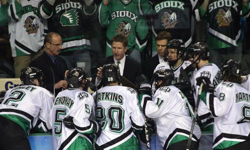
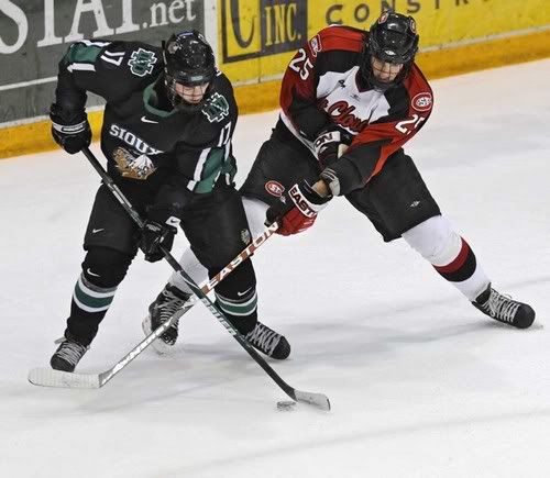
University of North Dakota Fighting Sioux: Home, Road, Alternate.
Teebz: First off, they will always be the Fighting Sioux. Political correctness isn’t necessary when speaking about UND’s storied hockey program. Green and white simply cannot be overlooked as a gorgeous combination for hockey. It shocks me to think that the one NHL team who used green, the Minnesota Wild, opted to stick with red. The black alternate looks decent as well. Green really does make a difference, though.
Phil: OH BABY. My absolute favorite, at least for the road uni. I’m prolly one of the few folks on UW who prefers the Celtics alternate to their regular uni (I know, shoot me), but that’s also why I love the Fighting Sioux road uni. For some reason, this is the only shade of green which looks great when accented with black (in fact, it’s probably the only COLOR that looks good when accented with black). That Sioux sweater and sock combo, with the black pants, helmet and gloves, I don't know — it just looks great! I could do without all the damn swooshes, and the font is not the best, plus the drop shadow is unnecessary…but damn, that can’t stop the power of the green and black. As far as the home and alt — take ‘em or leave ‘em (especially leave the alt). But that road green is just freakin’ sweet.
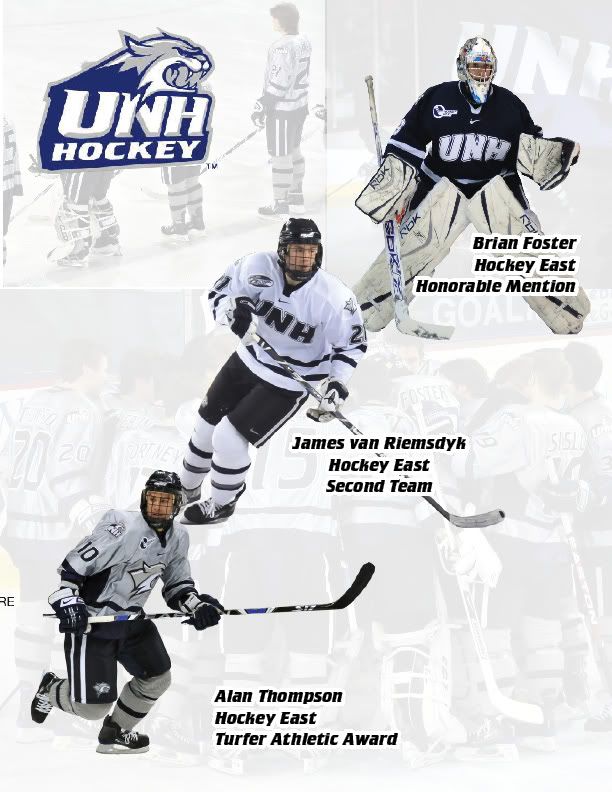
University of New Hampshire Wildcats: Home, Road, Alternate.
Teebz: I’m not sure why this is, but the Wildcats seem to play almost every game in their white jerseys. I scanned through their website, and all the pictures of the Wildcats team were in white jerseys. The white and blue jerseys look similar to Yale’s uniform set, but that grey/silver alternate is slick. I’m not overly impressed that the socks don’t match the colour of the jersey, though. Huge oversight on UNH’s part.
Phil: These kind of suck. But that’s not to say they don’t have some redeeming qualities. The font sucks. The stripes are great. At least, if you removed the wordmark (initialmark?) they’d be pretty solid unis. The alts are a travesty, however. Cartoon crest, non matching socks, side panels. Phooey. If there was ever a team that didn’t need an alt, at least if that’s what they’re gonna come up with, this is it.
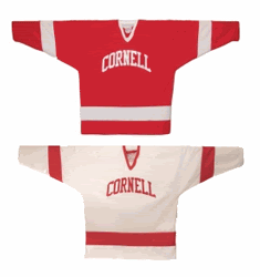
Cornell University Big Red: Home, Road, no alternate.
Teebz: Cornell shows that traditional two-colour uniform schemes work well. The red-and-white scheme worked well for Boston University, and Cornell is no different. Classy, simple, and a very good look. If I could change one thing, I’d add a shoulder yoke. That’s it. Otherwise, Cornell’s look is nearly perfect.
Phil: OK, I like these, but they’re not my faves, although they’re pretty close. I’m probably partial to Cornell because my pop’s an alumnus, and I always had an affinity for, and knowledge of, Big Red unis growing up. You can’t get much more basic than these, and that’s not a bad thing. Home and roads echo each other, which you know I like. And, well, they’re Big Red, so of course there is only going to be red and white in the uni. You may call it bland and boring, I call it classic and traditional. No extraneous striping, piping and bibs, just a workman-like uni. It works.
Princeton University Tigers: Home, Road, Alternate.
Teebz: Princeton looks like an ivy-league school in these uniforms. I love the shield logo on the front, and it really sets the rest of the jersey off. The striping is done well, and the orange-and-black colour scheme, like a tiger, fits to a tee. Unfortunately, the orange alternate jersey does make the Tigers look like moving pylons, similar to what the New York Islanders faced a few years back. There needs to be a white shoulder yoke to break up all that orange.
Phil: (*removing sunglasses*) If this were any team but Princeton, I’d probably hate it, but since they make black and orange somehow look great, I’ll give it a solid grade. The home is pretty good, and while I’m not generally a fan of the shield (or any symbol) on a college hockey jersey, the Princeton shield works. The black and orange fat stripe circling the jersey and repeated on the sleeve (with the number inside the stripe too!) looks pretty neat. Road uni = home uni mirror? Check. Now... onto that alternate... it’s not the worst uniform I’ve ever seen, but it’s not.. it’s not good. It’s just too much orange. Like... WAAAAAAY too much orange. I’m not advocating for the shoulder yoke like Teebz, but maybe, I don't know, not having an alternate would work. I don’t hate orange as a color, in fact it’s one of my favorites, but not this much. This is overkill.
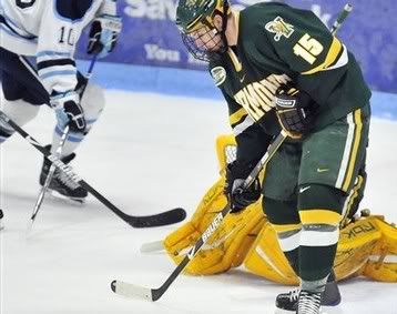
University of Vermont Catamounts: Home, Road, Alternate.
Teebz: Green and yellow is such an iconic look. The NFL’s Green Bay Packers wear it, and they are known for that colour combination. Vermont looks very classy, and I am a huge fan of their road uniform. What I don’t understand is why they would go black as an alternate when they had an incredibly beautiful green road jersey in their pockets. Vermont took steps backwards with their alternate choice this season.
Phil: Green and yellow is an iconic look … for Green Bay... and the Green Mountain State too, I guess. These are pretty nice unis, nothing slick and sassy, just pure, simple mapley-syrup goodness. Solid font, nice radial arching on the wordmark. Good color scheme. The alternates are pure crap unnecessary. That’s all I’m gonna say about that.
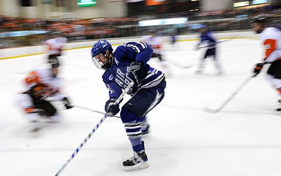
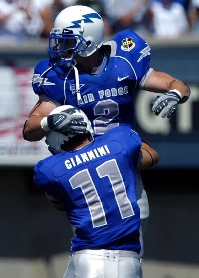
U.S. Air Force Academy Falcons: Home, Road, no alternate.
Teebz: The Falcons wear, ironically, Air Force Blue as their main colour, and mix in some grey for a pretty decent look. The one thing that bothered me was the lightning bolt on the breezers of the player in the road uniform. Why is that lightning there? What purpose does "ass lightning" serve?
Phil: Great colors, horrible font. What do they want to evoke with that? A sense of flying or something? I’m not a fan of the lightning bolt on the side of the breezers, but they may use it on some other stuff they have, so I’ll give it a free pass. While this uni is slightly more "modern" in appearance than some of the others, it’s not "badly" modern. Nice stripes on the bottom of the jersey and the socks (which match!) but I could do without the extra stripes on the shoulders. Still, not a bad uni at all. Thankfully there is no alternate.
Miami University (Ohio) RedHawks: Home, Road, no alternate.
Teebz: You know how when something works, everyone tries to copy it? Red-and-white work well as a colour combination. Miami-Ohio looks solid in their jerseys. Clean, crisp, and very well-dressed. Exactly what a hockey team should look like.
Phil: Who even knew they played hockey in South Florida? Certainly not Panther fans. What’s that? Miami is in Ohio? Who knew? All kidding aside, these are pretty solid unis. Seems like a lot of hockey teams wear red and white. Probably because it’s a great color combo for a hockey uniform. Nice and basic, it’s very workmanlike. I like the smaller stripes on the jersey sleeve on both home and away, although the outline around the numbers and wordmark isn’t really necessary. It’s not bad either. Damn fine uniform here. And no alternate, which is a bonus.
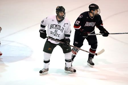
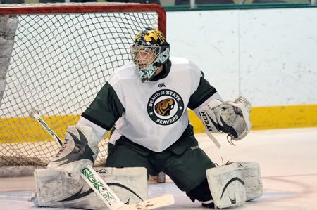
Bemidji State University Beavers: Home, Road, Alternate.
Teebz: Bemidji State goes green and white as well. These two-colour uniform schemes seem to be a very good mix for teams. I’m not sure if it’s the lighting in the road jersey picture, but Bemidji could use less dark green/black and a little more white in there. Mix it up a little, Beavers!
Phil: I like the colors, and the home and road uniforms are both damn fine. I’m not a fan of breaking up the "Bemidji" and "State" with a number, however. I guess with a name that long, it’s hard to make it look good, but it’s just not visually appealing in this instance. Also the vertically arched "Bemidji" and the horizontal "State" somehow doesn’t look right. But that’s a small complaint. Nothing obnoxious about either the home or road uni, and the stripes are perfect. The alternate is not one of the worst I’ve ever seen, and despite the cartoon beaver, I LOVE the crest. That circular logo is sweet, but I’m not a fan of the odd sleeve pattern. They just need to figure out what to do with that beaver.
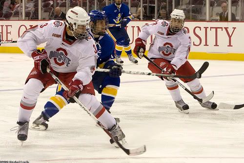
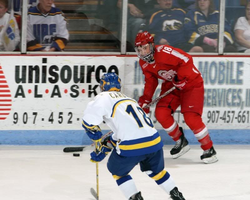
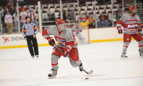
Ohio State University Buckeyes: Home, Road, Alternate.
Teebz: I don’t mind tOSU’s home and road uniforms. They are distinctly Ohio State, and the red and white colours are used again. The grey alternates, however, leave something to be desired. I’m not liking this uniform at all. Bland? You bet. Why waste the effort?
Phil: Lets start with the homes. Pretty solid uni, although the striping on the sleeves has gotta go. Colors are totally tOSU. Nice job except for the sleeves. Onto the roads. Despite the "mirror" quality of the road (which I like), it’s TOO MUCH red. I know they can’t wear white pants, but they look like the Cuban baseball team or something the US sent home in 1980 in Lake Placid. It’s not a bad look (excepting, again, the sleeve stripage), but it’s overkill on the red. Now those alts... another example of me "getting" what they’re "doing" but it’s just not working for me. It tries for that old time feel (a good thing) but it just doesn’t look right — especially in gray. The modern "Buckeye" wordmark, the helmets, the nike swooshes — it just doesn’t work for a throwbackish feel.
Well, there you have it. The final 16 teams (some of which have already been eliminated) in the Frozen Four. If you think I’m off the mark, or was a little harsh or whatever, let me know. After all, they’re just opinions, and even though mine are right you may feel differently. Tell me aboot it. – Phil
Atta boy, Phil. Honestly, I don't hate any of these jerseys per se, but I'm not fond of college teams having alternate uniforms. It just reeks of selling out, and, since you can't get a player's name on the back from the university team due to stupid NCAA rules, is there any point to making an alternate? For the most part, though, all of these teams have very good colour schemes, and all of them look pretty sharp.
Overall, a very good look at the best 16 NCAA teams this season. Comments are welcome, and I encourage you to stop in over at Uni Watch as well. You might find something on there that you like!
Until next time, keep your sticks on the ice!


1 comment:
It really brings a tear to my eye how many schools still look great! At least compared to the wave of mutilation that Reebok has cast on the NHL/AHL/CHL
I hate to play critic on such a nice entry, but you hit a peeve of mine....
You were WAY to nice on the Ohio State home/away and the North Dakota alt. Those are Nike Swift template sweaters, same as all the Olympic teams wore and caused me to gouge my eyes out in '06. They fit extremely awkwardly, all have the same cookie-cutter VERTICAL (seriously?) striping. Numbers on shoulders??
The Nike Swift are just as ugly in person as the worst Reebok Edge design.
Post a Comment